Trends in Web Design 2024
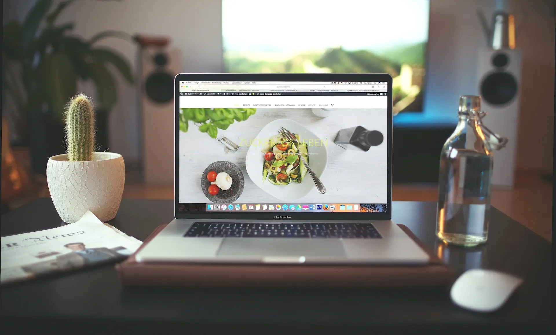
Web design trends are constantly evolving. To create impactful websites, specialists must stay updated on the latest changes in building online platforms. This knowledge helps attract more clients and maintain a competitive edge in the market.
Web Design Styles for 2024
The styles used for websites this year are diverse, ranging from brutalist grunge to trendy hi-tech. What characteristics can define the current directions in website creation? They include minimalism, naturalness, and sometimes unconventionality.
Neobrutalism
This trend involves abandoning modern standards of typography, illustrative, and animation features. Neobrutalism web design trends include:
- Unconventional background colors
- Absence of gradients
- Bold typography in a futurist style
- Strong contrasts
- Dark outline elements
- Shadows at a 45° angle
Such websites are ideal for companies targeting a creative audience. Examples of web resources designed with neobrutalism trends include Figma and Gumroad.
Retro Style
The retro style in website design remains appealing. This aesthetic emphasizes the era when the Internet first emerged. It evokes nostalgia with its unusual icons and attention-grabbing cursors. Key retro web design trends include:
- 3D text with glitter
- Bright, vibrant colors with a focus on pink
- Presence of gradients
- Glare effects
- Large, bold fonts
- Gothic-style images

Current Design Elements for Websites in 2024
One modern trend in web design is the use of white space, which highlights the main business proposition. Visually, this makes the screen appear larger. White can be combined with any other colors, enhancing the overall result.
Programmers are also advised to use high-quality photographs featuring a single element that conveys the firm’s idea and concept. This helps concentrate user attention.
Standard block placements have become outdated. The trends for web design in 2024 suggest organizing information in a broken grid layout, i.e., chaotically. This method sparks visitor interest and supports the brand’s identity.
An important feature of website execution is the careful consideration of the web resource’s structure. Reading occurs from left to right, so critical information should be positioned on the left side of the screen.
To avoid disappointment with the result, it’s best to entrust website design creation to professionals. GTRIX offers its services across Ukraine.
Among specialists, blending geometric shapes and patterns is popular. When combined effectively, these elements create an appealing composition. This approach refreshes the design of the web resource, making it modern and original.
A unique trend in top web design executions is the use of cinemagraphs. Cinemagraphs are static images with partial animation added. This innovative solution helps create an engaging page and communicates the purpose of the web resource to users.
Don’t forget about the classics. GIFs attract user attention without requiring verbose descriptions of the company. In 2024, traditional photographs are being replaced by unusual graphics. These should be colorful and ultra-bright, encouraging visitors to explore the online platform and discover that it and its products are worth attention.
In some cases, a website’s design benefits from using a full-screen photograph as the main background. This option is suitable for landing pages, business card sites, or promotional websites.
Looking for an ultra-modern solution? Incorporate 3D imagery.
Colors in Web Design 2024
Among the key color trends in creating web design, experimenting with bright colors stands out. This is particularly relevant for flat designs. If you’re unsure about which shades to use, refer to the Google color palette.
Effective website creation in Ukraine involves using unique fonts that significantly impact page design and enhance it. In 2024, turnkey online platforms lean towards minimalism. Thus, one solution is to use black, white, gray colors, and their shades. It’s advantageous if buttons are semi-transparent.
Gradients continue to be a relevant solution in terms of color theory. A gradient background adds freshness and uniqueness to the online platform.
